Decorating & home improvement · Retainer · Own venture
Brushly
Service Brand / Paid-Search Lead Engine
Visit Live Site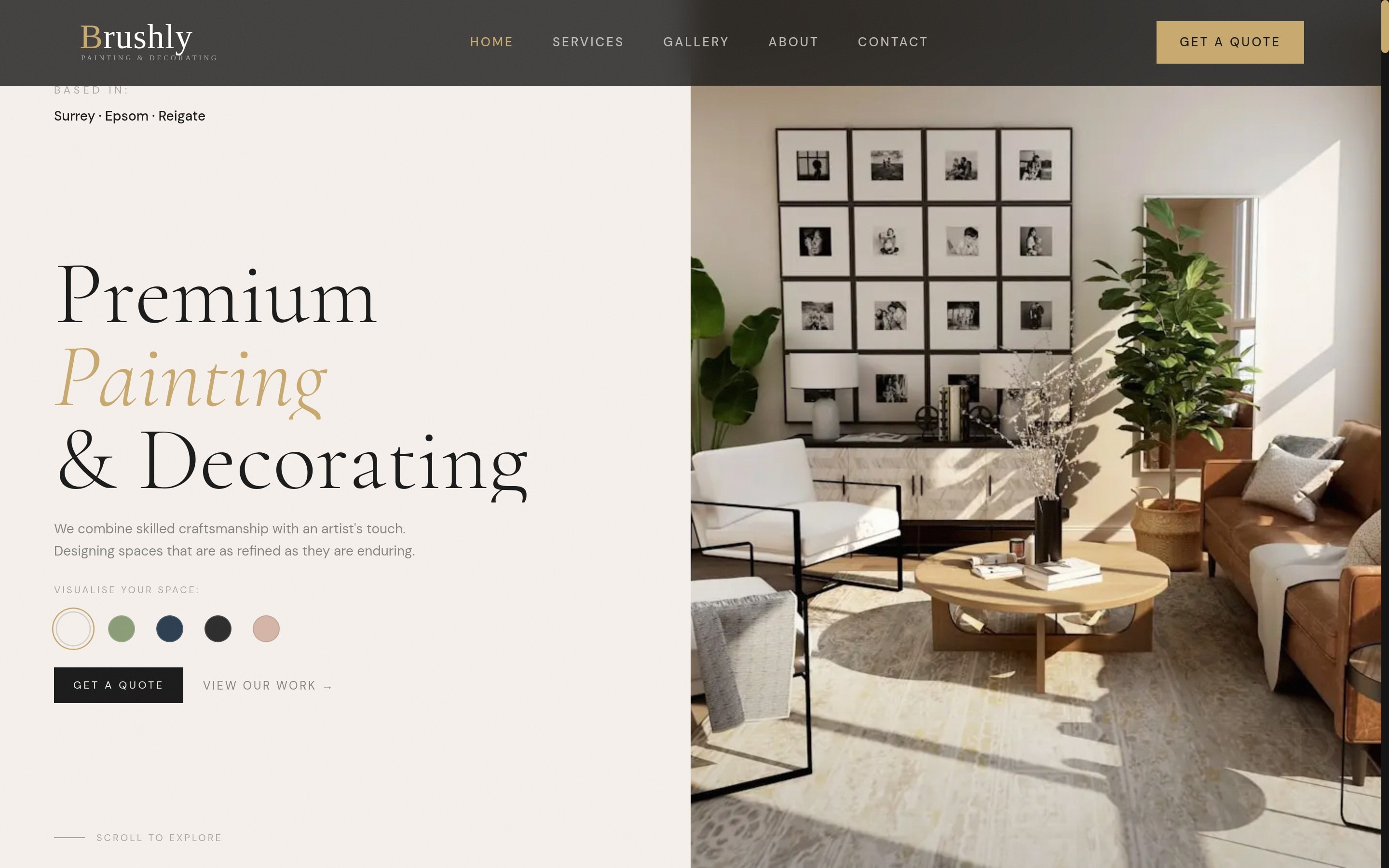
- Own venture
- Brushly
- Timeline
- Site 2025 — lead engine under management since Jun 2026
- Tech Stack
- Next.js, React, GSAP, Tailwind CSS, Google Ads, Vercel
- Live Site
- brushly.uk
In Brief
What
Brushly is a premium painting-and-decorating company in Surrey — and it is ours: GoSmartR’s founder operates it, so the brand, the site and the paid-search engine all run on our own money and risk. The engagement is the full stack we sell: craft-led brand site plus managed Google Ads with real conversion tracking.
What was hard
Trades advertising is where ad budgets go to die: generic keywords, no conversion tracking, and no way to tell a £60 click from a £600 job. The bar was a lead engine whose numbers survive scrutiny — every lead tracked to a phone call, a WhatsApp tap or a quote form, and a cost per lead the job economics clearly clear.
How
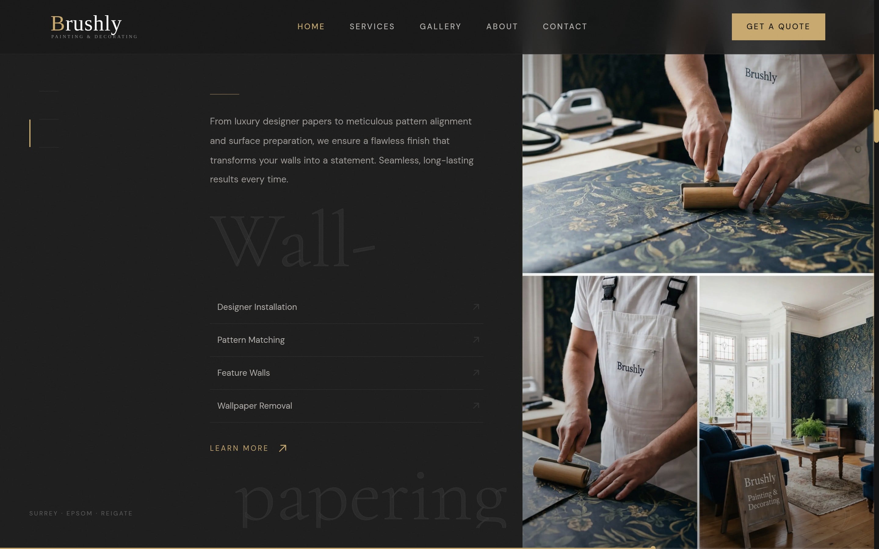
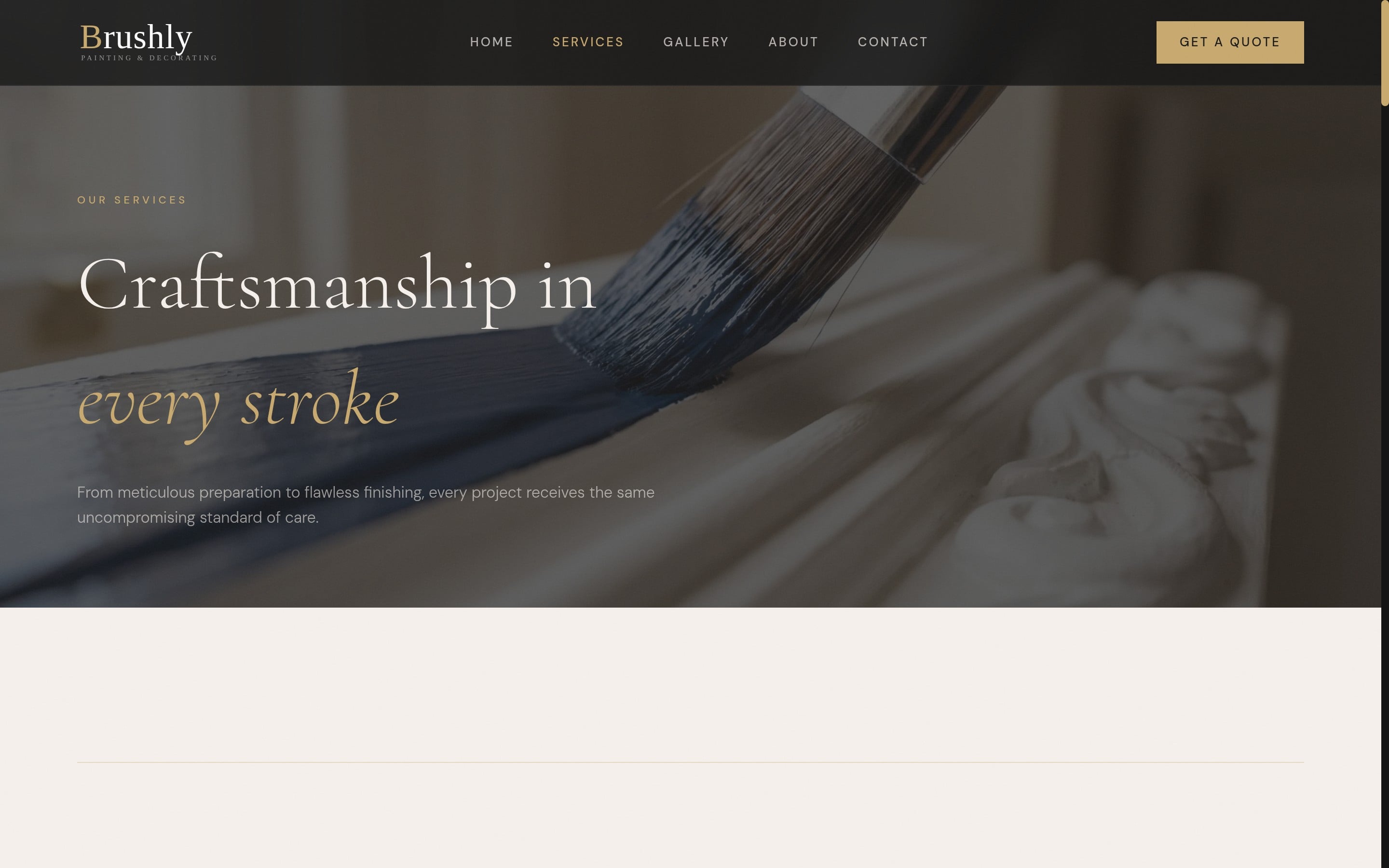
The site presents the craft in the register of the paint brands its clients already trust — restrained, typographic, before/after led. Underneath it, the managed Google Ads account tracks three separate conversion actions (phone click, WhatsApp click, quote form), splits spend across keyword themes from "house painters" to "local painter and decorator", and prunes by CTR and cost per lead rather than by feel.
Result
Over the twelve weeks to 30 August 2026: £1,682 of spend produced 595 ad clicks and 26 tracked leads — roughly £65 per lead against jobs worth many multiples of that — with the best keyword theme ("local painter and decorator") clicking through at 10.18%.
The Challenge
Brushly had built a reputation for immaculate craftsmanship across Surrey, but its digital presence told a different story — and its lead flow depended entirely on word of mouth. The brief was the full stack: a site that felt as considered as the Venetian plaster finishes, and a paid-search engine underneath it that could be judged on tracked leads rather than impressions. Because Brushly is our own company, there was nowhere to hide a vanity number: the ad budget is ours.
A closer look
The Design
The Approach
We built the brand site in the visual language of the paint houses its clients already trust — Farrow & Ball, Little Greene — with before/after reveals, a colour visualiser and typography that whispers rather than shouts. Then we wired the commercial layer: a managed Google Ads account with three separate conversion actions (phone click, WhatsApp click, quote form) so every lead is attributable, keyword themes split from broad ("house painters", "painting and decorating services") to high-intent local ("local painter and decorator"), and spend pruned by cost per lead, not instinct.
Designed to work
The Solution
Interactive Before & After
Drag-to-reveal comparison tool showcasing transformation quality — the most convincing sales asset on the site.
Three-Channel Lead Tracking
Phone clicks, WhatsApp taps and quote-form submissions each tracked as separate Google Ads conversion actions — so "26 leads" means 26 attributable lead events, not a proxy metric.
Keyword Themes Pruned by Economics
Spend split across intent tiers and judged on cost per lead: the high-intent "local painter and decorator" theme clicks through at 10.18% and earns budget; loose themes get cut.
The Results
In their words
Brushly transformed our entire home with extraordinary attention to detail. The finish is absolutely immaculate.
Continue browsing
All work