01Client
Maison Noir
02Timeline
5 weeks
03Tech Stack
Next.js, React, Tailwind CSS +2 more
04Live Site
Visit →01The Challenge
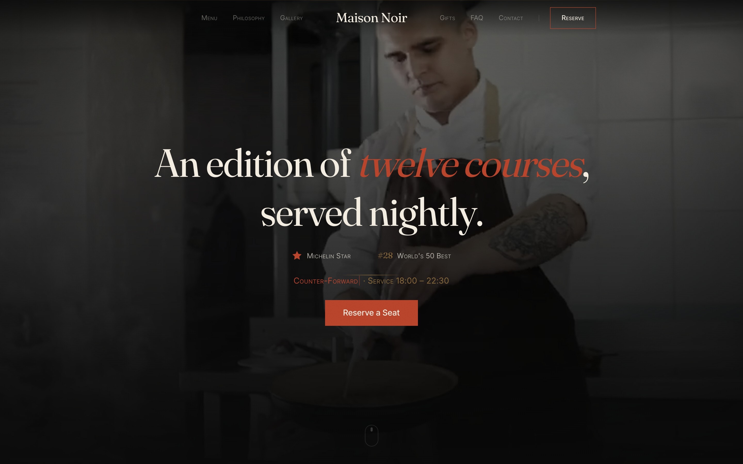
A Michelin-starred counter-forward restaurant doesn’t need to advertise availability — it needs to communicate intent. The previous site treated the kitchen like a retail venue with a booking widget bolted on. Maison Noir wanted a digital presence that reads like a small-press literary publication — something a guest would willingly read for the pleasure of the prose, not because they need a reservation link.
The Design

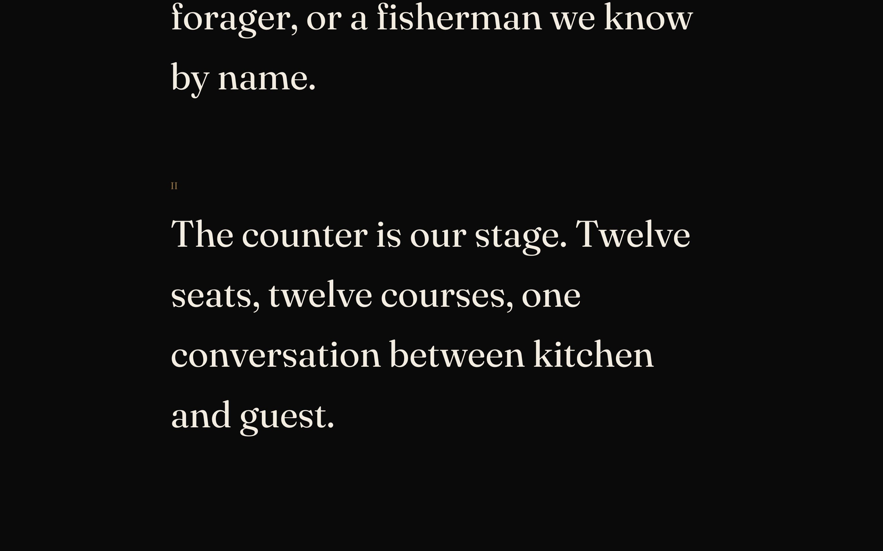
02The Approach
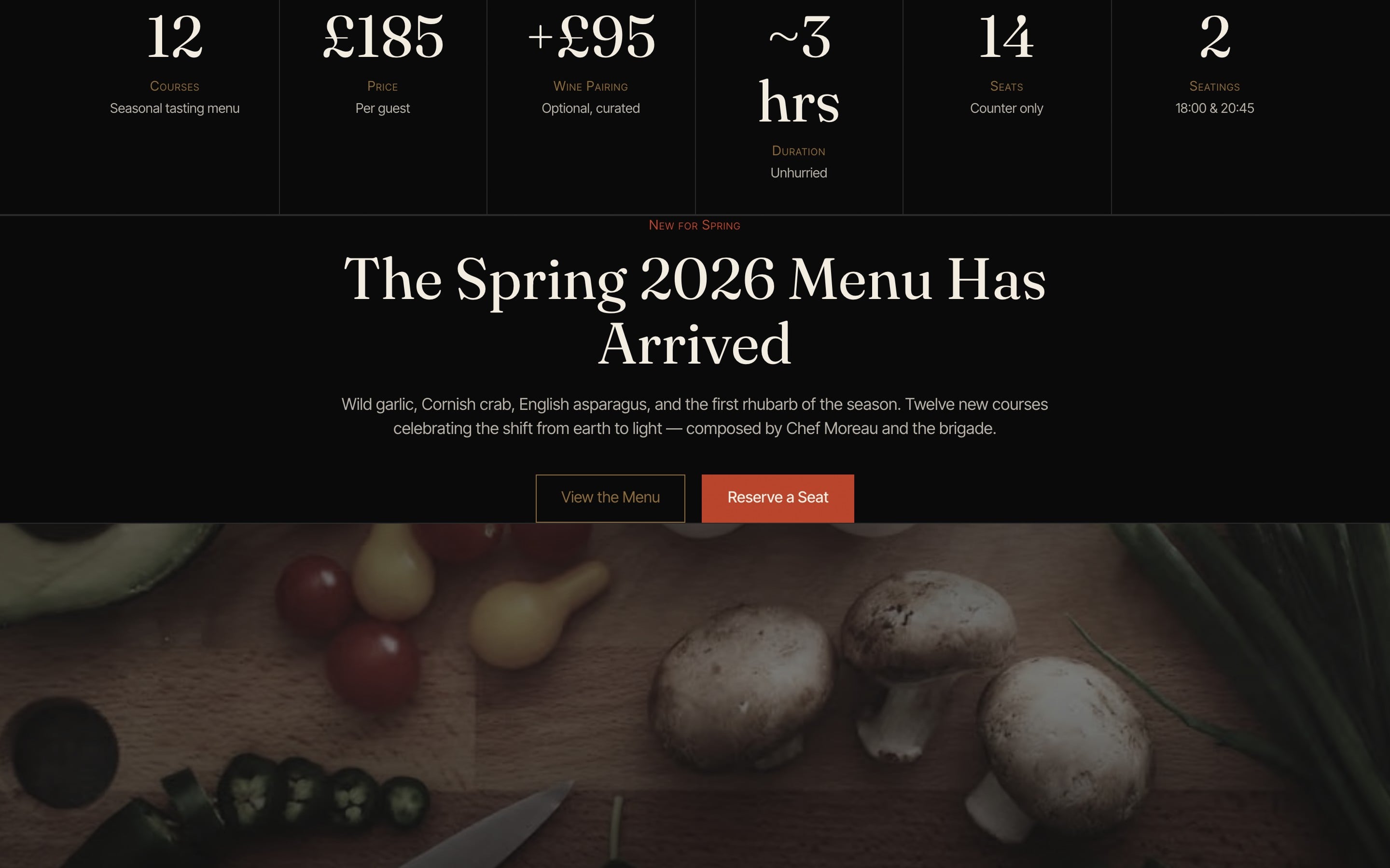
We built the entire site around long-form editorial typography. Each section opens with a Roman numeral, breathes in two-column body copy, and uses a single terracotta accent inherited from the dining room’s exposed-brick wall. Critical service data — 12 courses, £185, ~3 hours, 14 seats — lives in a stat row that quietly answers operational questions without ever feeling transactional. A single, restrained "Reserve a Seat" CTA recurs at natural pause points.
The Solution
Editorial Two-Column Prose
The philosophy, menu, and counter sections are typeset like a magazine essay — large serif body copy, Roman-numeral section markers, intentional negative space. The site rewards reading.
Service Stat Strip
A six-cell row — Courses, Price, Wine Pairing, Duration, Seats, Seatings — surfaces the operational facts a serious diner asks first, without resorting to a FAQ accordion.
Counter-Forward Reservation Flow
14 seats, 2 seatings, no à la carte — the booking flow honours the actual format. No party-size dropdowns that would lie about what dining there means.
04The Results
0
Michelin Star
0
World’s 50 Best
0
Counter Seats
Next Project