Self-initiated · Concept
Brew Bliss
- Concept
- Brew Bliss
- Timeline
- 3 weeks
- Tech Stack
- Next.js, React, GSAP, Tailwind CSS, Vercel
- Live Site
- brewbliss.cafe
The Challenge
Brew Bliss had the bean sourcing, the recipes, and the master roasters — but a generic Shopify storefront that read like every other indie coffee site. They needed a brand experience that signalled "obsessive craft" the moment a visitor landed, then converted that emotion into orders.
A closer look
The Design
The Approach
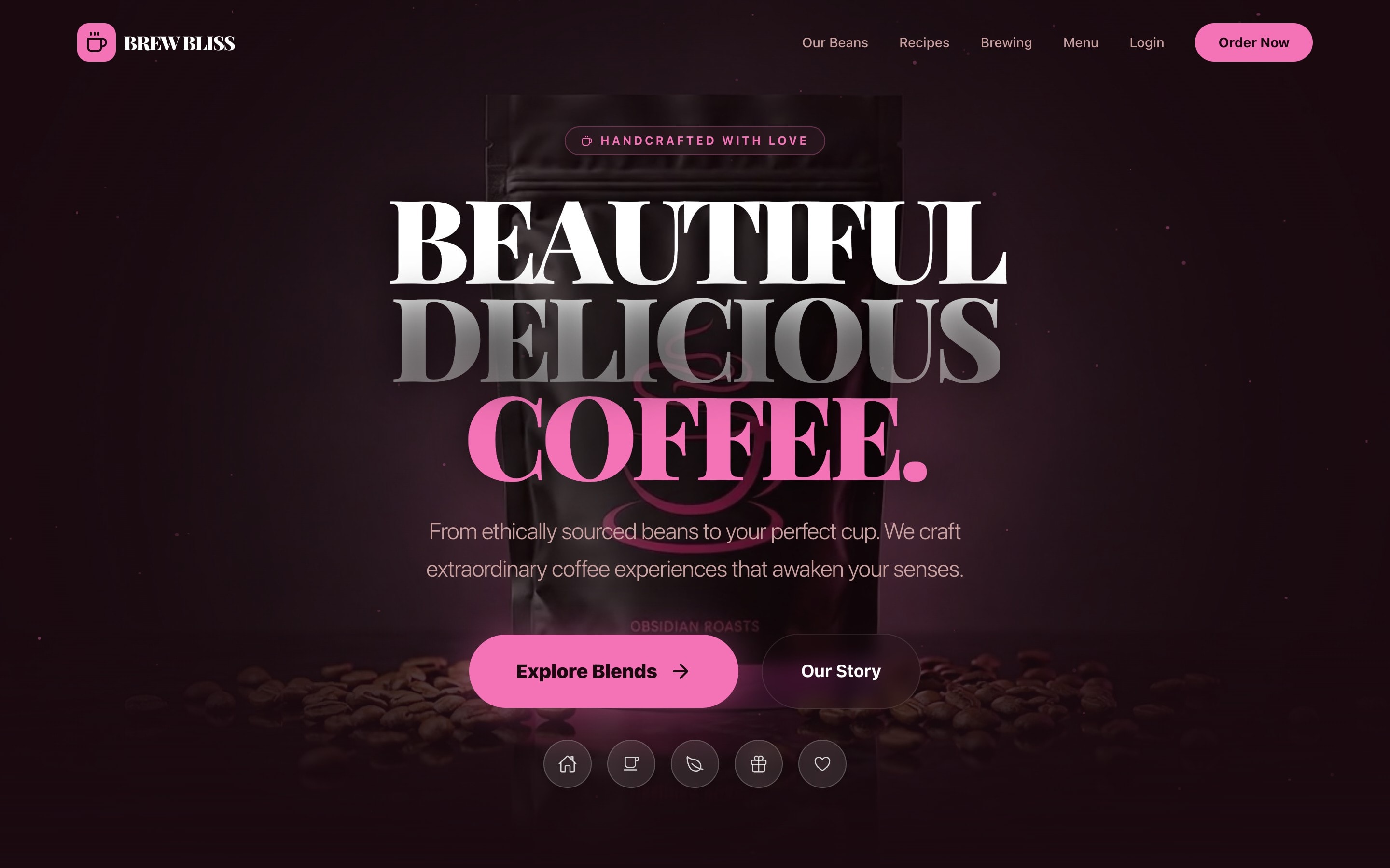
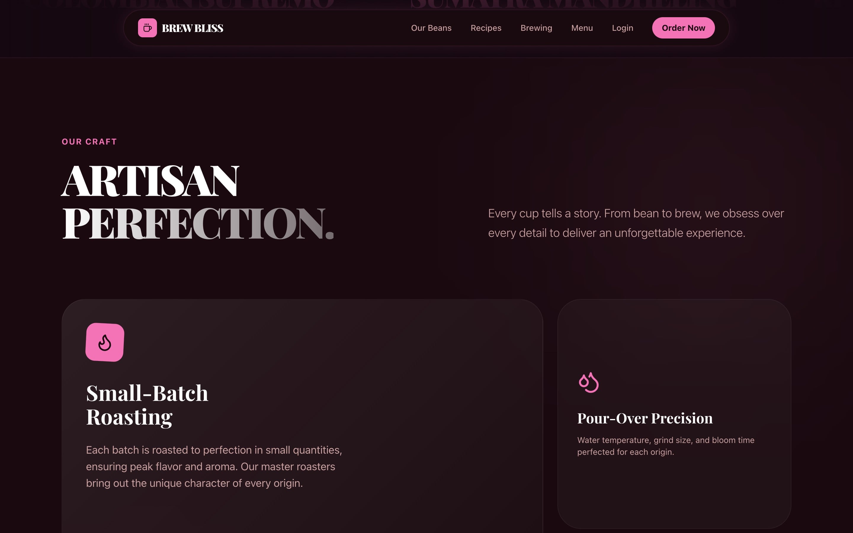
We treated the homepage like the front cover of a small-press magazine. Display serif type pushed to the edge of legibility, a near-black plum palette with a single rose accent, and a static product hero swapped in for the usual rotating banner. A persistent micro-dock for Order, Recipes, Brewing, and Loyalty keeps the highest-intent actions one tap away on every page.
Designed to work
The Solution
Editorial Hero Typography
Three-line display heading with selectively coloured words ("BEAUTIFUL DELICIOUS COFFEE.") — reads as a poster first, a banner second.
Persistent Action Dock
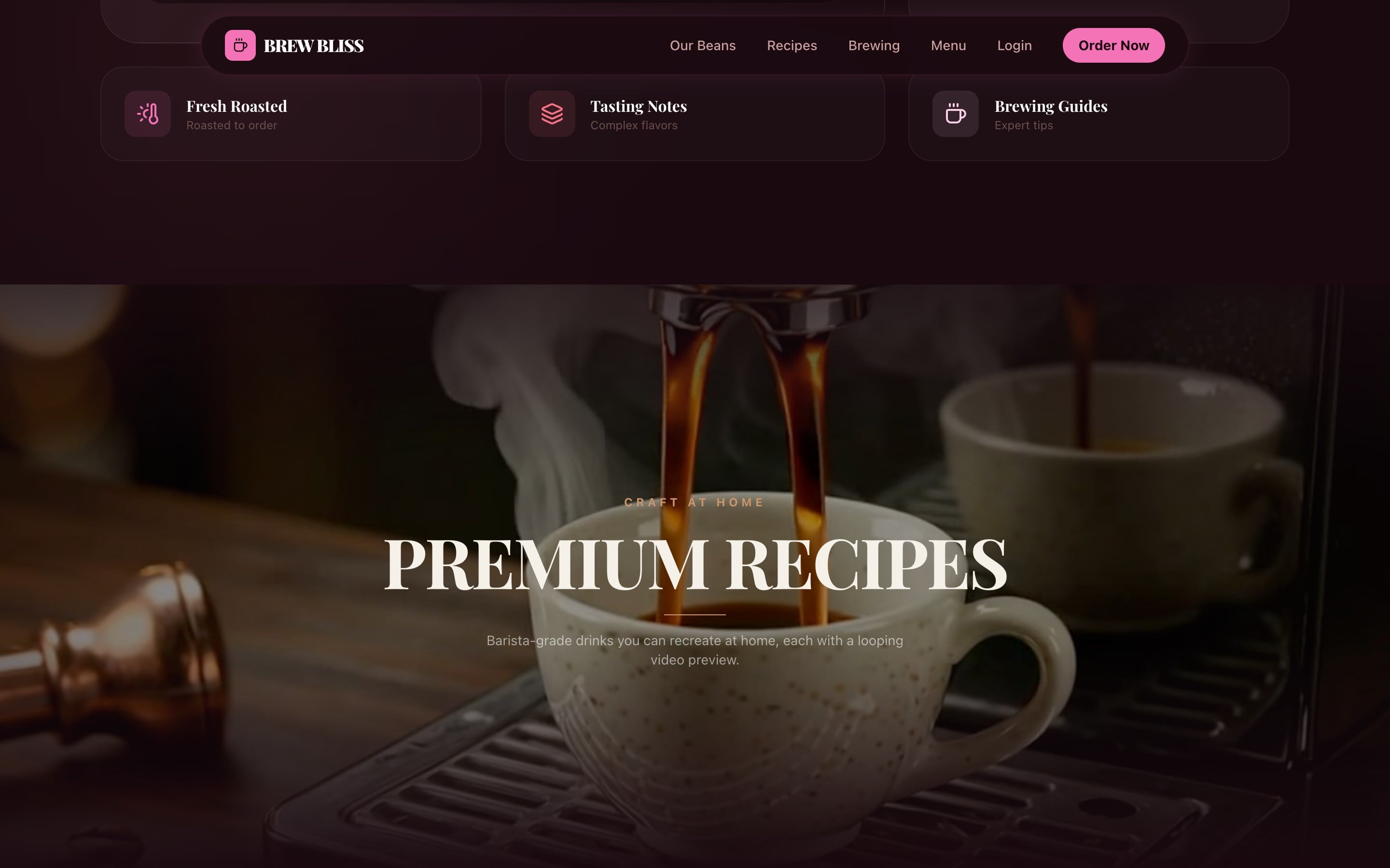
A floating five-icon dock (Home, Cup, Origin, Gift, Loyalty) glides with the user across every page — mobile-first, never further than a thumb away.
Premium Recipe Library
Looping silent video previews on each recipe card — espresso pours, milk textures, brew rituals — turning a category list into a tactile gallery.
The Results
4
Bean origins in the demo menu
5
Dock quick actions
3
Weeks to build
Continue browsing
All work